CLIENT:
Bed Bath & Beyond
CATEGORY:
UX/UI, Desktop, Mobile
PROBLEM STATEMENT
Users creating a registry are dropping off during the creation process at high rates.
User research, competitive analysis and initial user journeys
We needed to understand what was making potential registrants drop off the creation flow. Was the form too long? What were some pain points registrants were encountering?
Current online experience:
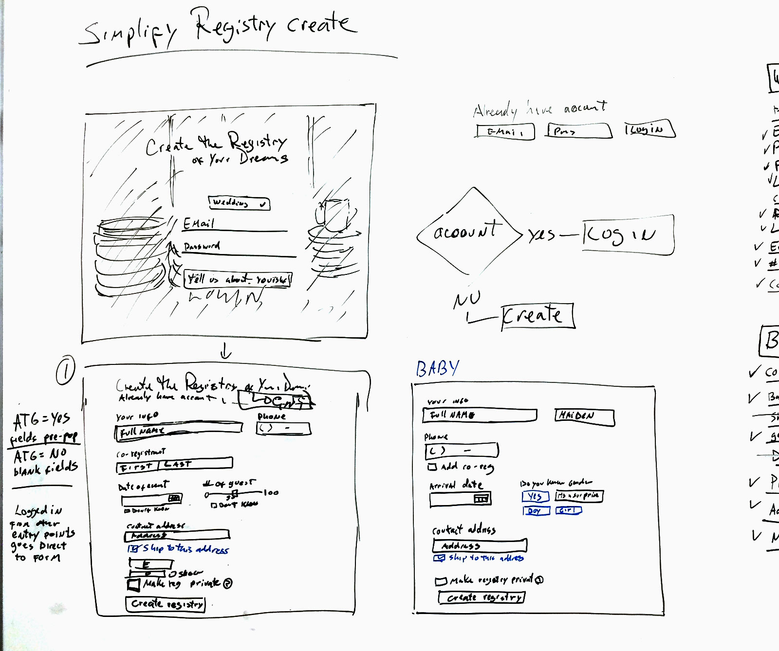
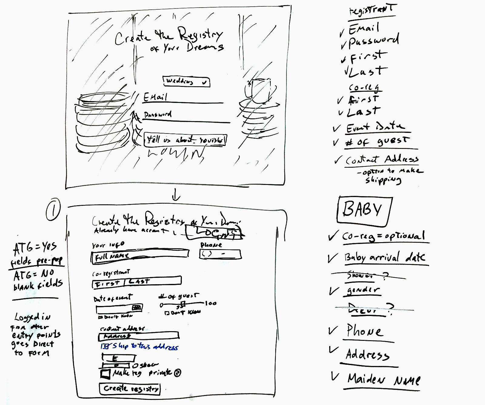
New registrant comes to the site to create a registry, upon clicking on CTA users is notified that a Bed Bath & Beyond account is necessary to create a registry. If user accepts the prompt to create an account they are taken away from registry experience to a create account page. After user creates an account, user has to navigate their way back to registry form.
Registry create form is a multi-step accordion style form with no indication of how many steps are required to complete the registration process.
Identify Key Goals for online experience
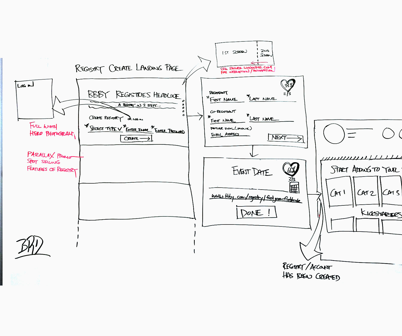
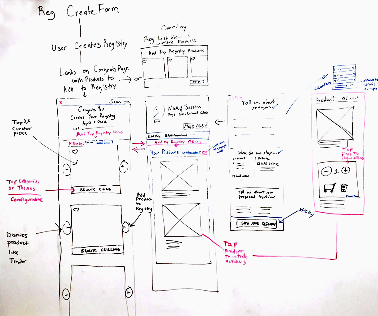
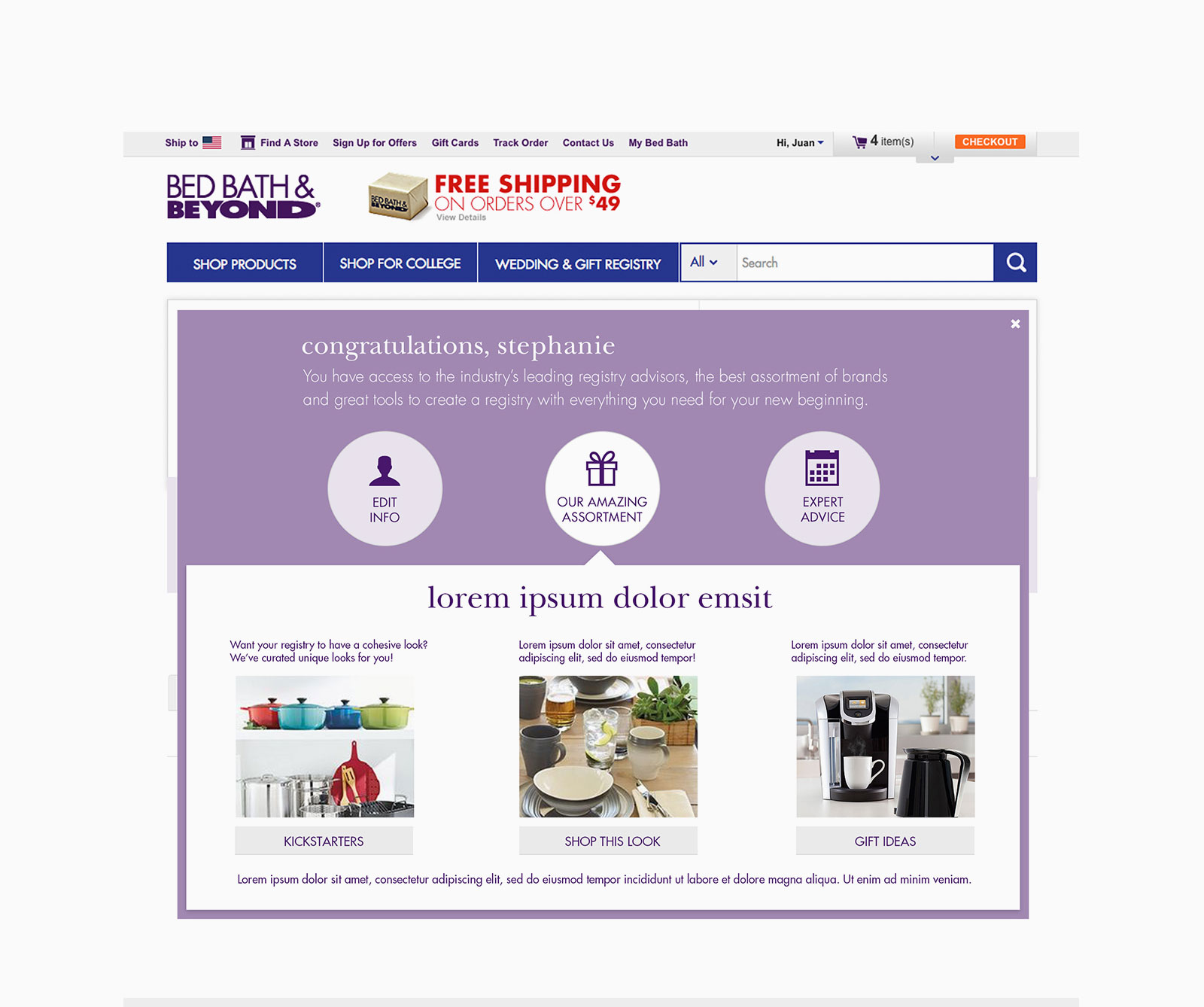

Final Desktop Mobile Web UI
Eliminating the need for users to create an account then a registry was a big win for registry creation, drop off was greatly reduced. Users found it easier to create their registry, the solution also provided a way for marketing to directly drive traffic to create form without worrying if a user had a site account or not. Users were also presented with a guided experience to start adding products to their registries.